Guess what!!!
I'm a Guest Designer again over at 7Dots Studio!!!!
It's always been a dream of mine, and I was thrilled that it came true last month. What could be better than that????
Guest Designing AGAIN!!
That's what!
I'm on a creative high, so let's go and take a look at what they had to say about me.....
Hello friends. Do you miss Spring? I do.Spending time outside, gazing at the stars… I do miss warmer days.
Tammy Klingner is today our Guest Designer and her layout will give you a bit of warmth
Let’s Meet....
G’day, my name is Tammy Klingner and I live in the beautiful Clare Valley in Australia with my two amazing teenage children. I have been scrapbooking in one form or other for 14 years! I can’t imagine not having the creative outlet. It’s my peace, my joy and my sanity. I absolutely adore colour and you will find vibrant colour on most of my layouts. I also love to use paint and all things mixed media!. I absolutely love 7 Dots Studio products and am so thrilled to be guest designing here. Thank you!
I was inspired by the gorgeous colours of the mood board and that magic light that was evident in lots of the images.
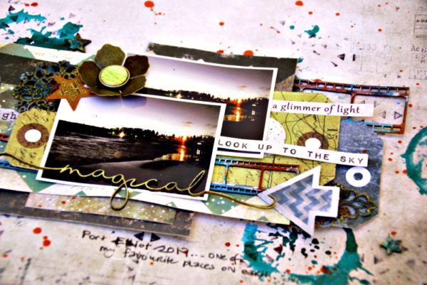
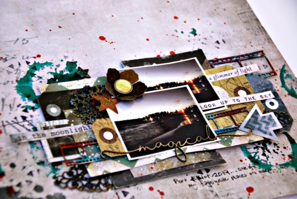
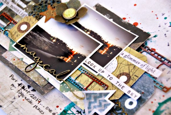
Recently, on a family holiday we spent a night sitting at the beach, watching the sunset and then enjoying the view by the light of the moon. How lucky am I to be able to do this, to forget all my daily worries and just enjoy the magic of the moment. I used a photo I snapped on that night – it just fit the theme perfectly and by including it on this layout, it means I can always remember how magical the night was.
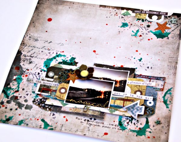
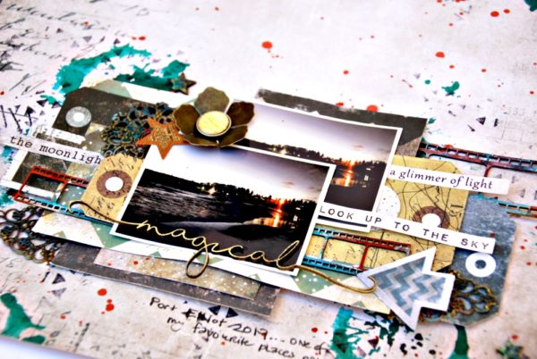
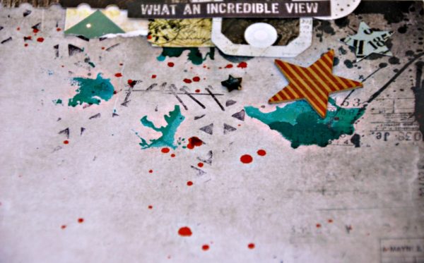
I began by adding some colour to the background by applying some Ink Spray onto my fave 7Dots Stamp – Hazy Days. That paint splatter appears on most of my backgrounds. It looks great in black ink and it also looks great in colour. I then added some stamping to my background using another stamp from this set and also a triangular background stamp from the Dreamscapes Collection. This time I went with black.
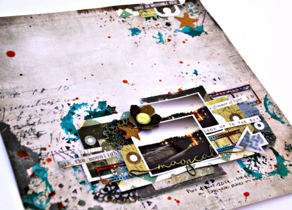
I then layered lots of tags and embellishments from a variety of 7Dots ranges as a background to my photos. I also added some to the top right corner of my page. This helps create the visual triangle that enables they eye to focus on the layout, and be drawn into it. I really love that all the 7Dots ranges complement each other. I love using a bit from this range and a bit from that range. It really makes the process fun and different every time!
I hope this inspires you to get creating, why not join in the fun of the 7Dots Challenge this month!
Thanks so much for having me. I’m thrilled to be asked to be a Guest Designer again!
There you have it.....
Thanks so much 7Dots Studio for having me again.
I also used loads of 2Crafty Chipboard in this one.
Here's a look at the challenge that inspired the layout.....
Love Tam
xxx


No comments:
Post a Comment