Friday, 27 July 2018

My Second July 2Crafty Chipboard share

I've popped in today to share my latest creation for 2Crafty Chipboard......
 
This one's titled:
 

"True Beauty"


A page celebrating my girl who is the image of True Beauty. Inside and out.


I used the following 2Crafty Chipboard:
 
"Beauty script title"
"Circle Stack"
"Flowering Clusters"
"Weeping Vine"


I just love the colours and the ombre effect on the "Flowering Clusters".
 
I created this by first applying a couple of coats of white gesso, and then using Dylusions Ink Sprays.  Instead of spraying them on, I applied them with a paintbrush which gives a much stronger and more vibrant finish once dry.


I used the colours 'Polished Jade' and 'Fresh Lime', and I let the colours blend in the middle.
 
These are available from my favourite scrappy supply store Scrap Matrix.


These "Flowering Clusters" are new to the 2Crafty range and I just LOVE them, and know I will be using them again soon.


I painted the "Weeping Vine" with a couple of coats of white gesso and then white acrylic paint.
 
I then cut it down and tucked it into various parts of the layout.


I selected a circle from the "Circle Stack" that would act as a frame around my photos.
 
I painted this with a couple of coats of white gesso and then stamped over this with black ink and a script stamp.
 

The background stencil is by Aall & Create.
I used a few tags from 7Dots, as well as some of their word stickers in my layers around the photo.
I made some tags too using paper I had created with my Gel Plate. 

These are all sourced from Scrap Matrix too.


Finally I added the "Beauty Script title" to the top edge of the frame and gave it a couple of coats of black paint.
 
I adore the black and white mixed with the turquoise and lime.
 
My favourite colour combination.


This page was taken prior to my girl attending formal for High School.
 
Leading up to this night, she had bought an amazing dress.
 
There was lots of pressure on her (ridiculous!) to have her hair done, her makeup done, fake tans etc, but she refused. She just wanted to be herself.
 
This made my heart swell, and I was so proud of HER!!
I wanted to document THIS.
 
 
The journaling reads:
 
"Beauty begins the Moment you decide to be yourself"
"You are truly beautiful inside and out - sounds cliché but I love that you don't get caught up in all the fakeness that surrounds our teenagers. The fake tans, eyebrows, eyelashes. They must look in the mirror and wonder who is looking back at them. Youth is beautiful. So is being you.
That's all you need."


Well that's it from me today, I hope I've inspired you, thanks for popping by.


Thursday, 12 July 2018

Tam's second take on the Sweet Challenge

Hi everyone, Tam here today.
 
Are you just LOVING the 'How Sweet it is' Challenge over at Scrap Matrix?
 
I know I am - I love that it can be interpreted in so many different ways.
 
Today I'm sharing my second creation. 
Last time I was inspired by the colour and the circular shapes, this time I've taken a totally different angle......as soon as I saw that picture of that heart shape and the sunset, I knew I had the perfect photo.....

 
These photos were taken on our annual January holiday to the beach.  My girl and I had a bit of fun on our final night and amongst the photos, I had these.
Just perfect. 
 
 
I had a blast creating that background.......


Let's have a look at how it all came together....


I began by adding some white gesso to black cardstock.  I focused this just in the areas where I knew I would add my mixed media - the gesso acts as a primer for all the wet product that is to come.
 
 
Next I added Dylusions Ink Spray in 'After Midnight'.  A gorgeous deep night sky colour.
 
Whilst this was still wet I placed a 7Dots Geometric Stencil on top, and rubbed gently with a nappy wipe.
This removes a little of the colour and adds some pattern.

 
Once dry, I added some big splodges of Dylusions Ink Spray in 'London Blue'.

 
Once this dried, I got out some of my Dylusions paints - love their bright, vivid colours.
 
I also grabbed an old 'store card' and dipped it into the paint colour and then placed it on the layout.
This gives a lovely liney texture.
 
I did this with the following colours:
'After Midnight'
'London Blue'
'Calypso Teal'
'Crushed Grape'
'Squeezed Orange'

 
I only used a very small amount of 'Squeezed Orange', just for a bit of contrast and to make the page 'pop'.  Too much would have overwhelmed the other colours and ruined the effect I was aiming for.


Finally I added some white paint in the same way, just to help 'pull' it all together.
I then added some flicks of white paint.

 
At this point I was happy with the result.

 
Ok with the background complete, it was time to concentrate on the photos.

 
I began by gathering some papers.
I used some 7Dots 6x6 paper pads - I love mixing the ranges, and for this one I used some 'Paint Chips', some 'Verano Azul' and some 'Northern Lights'.
 
I cut out a few tags and grabbed a few from my stash too. 

 
I wanted them to be quite random, and in all different sizes.

 
I added some muslin behind my photos and then began to poke and layer the tags around this.


Time to add some embellishments.
I dug out this PinkFresh Ephemera Pack - from this I found my title
 'Something beautiful is on the Horizon'; and couple of words and a pile of stars.

 
Next I added some Scrap Matrix Metal - these reminded me of a moon, so they were perfect.

 
I added a few word stickers by 7Dots Studio.

 
And finally those little stars.


Here's another look at the finished layout.
 

I finished it off with just a few flicks of orange paint.  Again not too much!!


I had a lot of fun creating this one, and really love how the background complements the photos and the beautiful sunset.  It reminds me of the magical/celestial feeling that surrounds you when watching a sunset.


I'm really loving seeing all your entries this month.
 
You've still got plenty of time to join in, so here's a reminder of the challenge......


So get creating and head on over to the Scrap Matrix Shares Facebook page to upload your entry.
Don't forget to let us know what product/s you've used that are available at Scrap Matrix.
 
That's it! No blog necessary.
 
Well that's it from me today, I'll see you again soon.
 
 
Scrap Matrix Products used:
 
Black Bazzill
7Dots Stencil
7Dots Verano Azul 6x6 Pad
7Dots Word Stickers Cotton Candy


Friday, 6 July 2018

2Crafty Chipboard Layout and VIDEO TUTORIAL

I've popped in  today to share my latest layout for 2Crafty Chipboard, plus I have a video tutorial to inspire you too.
Today's creation is titled:

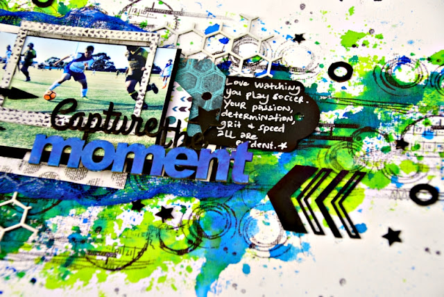
"Capture the Moment"

A layout featuring an action photo of my boy playing soccer. 
As he is a teen, I went bright colours and added lots of black grunge.

To replicate the soccer theme, I went with lots of circle stamps in the background. Both are by Aall & Create and available at Scrap Matrix.

 
I used loads of yummy 2Crafty Chipboard:
"Capture the Moment Title"
"Assorted Arrows"
"ATC Tiny Hearts & Stars"
"Chicken Wire Panel"
"Polaroid Frames"
"Dotty Bits"
"Chevron Bits"


I applied white gesso and a coat of white paint to the "Chicken Wire Panel".
I selected this piece of chipboard as the hexagon shapes reminded me of the soccer ball shape.


I love the black and the white contrasted with the bright blue and lime.


For the title "Capture the Moment", I painted the top section in black acrylic paint, and to the bottom section I applied white gesso, and then painted on some Dylusions Ink Spray in 'London Blue', available from Scrap Matrix.

I really love those titles with two different fonts.


I like the grunge effect the Dylusions Ink Spray gives it.
 
I love my Dylusions Ink Sprays - they are my go to. I love the bright colours and the vividness. They are all available from my fave online scrappy store Scrap Matrix.


I painted a 'Polaroid Frame' in white gesso, then white paint, and to go with the grunge feel, I randomly stamped a background stamp onto them.

I love the look of this and it was perfect to highlight my boy in the layout.

Remember, I'm aiming for grunge not perfection.


I painted the remainder of the Chipboard that I used in black acrylic paint.
Again I love how this pops against the background, and the black works so well for teen boys.
Simple yet effective.


You can see the arrows here, painted black.
They are pointing towards both the soccer ball and the title.


I also added a few stars from the "Tiny Hearts & Stars" pack, plus I trimmed a few of the "Dotty Bits" and randomly added these circles to my background.
Again, these replicated the soccer ball.


The final touch was some of the "Chevron Bits".
I pointed these towards the title and the layout in general.
This focuses the eye into the layout.


That is it!!
A bright yet grungy teen boy layout.


I've created a video tutorial of this layout, so you can see exactly how it all came together.
Here it is, I really hope it inspires you to get creating.....


I'll be back again real soon!